{the owner collects vintage seltzer bottles}
As an aside, I saw some beautiful, old seltzer bottles at Tuesday Morning (of all places!) in Charlottesville, VA at least 5 years ago and bought some. They were genuinely old too (crusty and clouded). For some crazy reason, I returned them and have been kicking myself ever since!
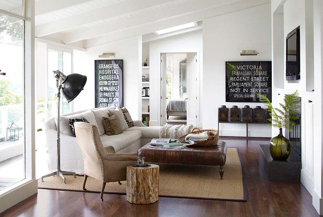
{living room}
Generally, I think subway art is really overdone BUT these are actually old London bus signs bought in an antique store. Antique tea tins line the console below the sign on the right. I think this living room is perfect for a young family. I would probably use paintings in place of the bus signs though if this were our home.
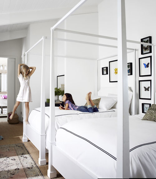
{twin 9 year old daughters' bedroom}
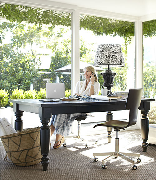
{home office}
How beautiful is that natural light and gorgeous view? Her desk is a pottery barn dining table.
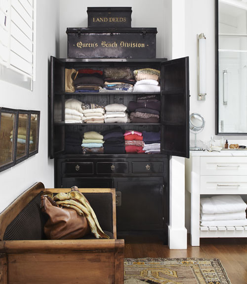
{bathroom}
I love furniture in the bathroom.
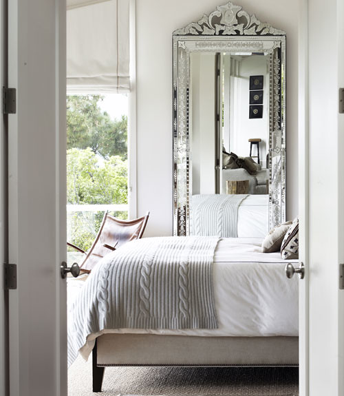
{a peek at the master bedroom--love it!}
Homeowner/Designer, Kendal Agins Friedman did a great job of mixing in modern pieces with antiques and light with dark to create a warm, casual and modern living space. What do you think?
All images courtesy of Country Living Magazine.




my husband my a tree side table for our daughter just like the one in the den pic:) Ha, had no idea we we cool!!:)
ReplyDeleteOh yes. They are very cool.
DeleteIt's a beautiful house but I can't help but cringe at those gorgeous white linens in the 9 year olds room. :)
ReplyDeleteI know! Kate has white linens in her bedroom and they have been fine. She gets occasional nosebleeds so Oxy Clean is our dear friend:) I find that between bleach and or oxy clean, white towels and linens are easy to care for.
DeleteLovely home! Though, with two inside dogs, a little boy, and a toddler on the way, white would never work for us. :/ Do you mind explaining how to do my settings so that I can reply straight back to comments? I love this feature! Thanks!
ReplyDeleteYou go to settings, comments, and then this section
DeleteComment Form Placement
Full page
Pop-up window
Embedded below post
The embedded comment form can not be used if you have Post Pages disabled.
Choose embedded comments and save changes. I am 99% sure that will do it.
Kim
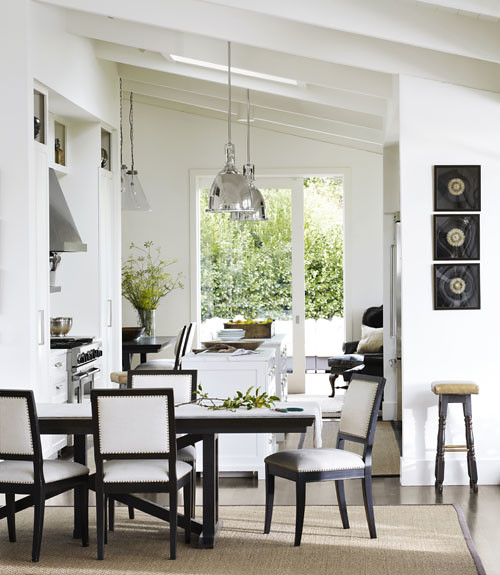
OMG I love it too. Where do you think the Dining Room/Kitchen table and chair come from? I love them. Oh and the Office Desk?
ReplyDeleteThe article says the chairs are antiques upholstered with Belgian linen and the office desk is a dining table from Pottery Barn.
DeleteI'm not generally a fan of black and white decor, but they did a really neat job with this house! Love the office with the natural light!!!!
ReplyDeleteWow -- so beautiful!!! Love it!
ReplyDeleteNice to see you back so soon..lol. Love the vibe too, it says easy, come on in, clean and crisp. I love the oveall feeling though in general I am not partial to black and white, this one is really well done.
ReplyDeleteAfter seeing this, I can understand the urge you had to share it!! It´s beautiful! I´d like to have that office table.
ReplyDeleteI have just discovered your blog and I´m enjoying it very much!
I think every room is stunning!!
ReplyDeleteThank you SO much for the pancake recipe! You are too sweet!
xojoan
So clean and fresh thanks for sharing.
ReplyDeleteKim, I love your blog and have been reading for a long time. I always have trouble posting a comment, so I hope this works. I saw so many of these types of collectables at Round Top/ Warrenton antique fair this weekend. I live in Austin, but the drive from Houston is just as quick if not shorter. Best day trip ever! You would love it if you haven't already checked it out!
ReplyDeleteI have been to Roundtop before but did no go this month/week. I am trying to save $$$ and I have no restraint there at all! Maybe in October?
DeleteLove, love, LOVE this house, too! You've inspired me to just get a Country Living subscription. They should give you a commission!
ReplyDeleteI love the overall interior and all the stuff in the house. Looks like the mind behind it really knows how to please everyone in the house. What I like most is the home office because it's not boring and possess elegance. I do like as well the bedroom of the tween.
ReplyDelete________________________
Love Life to the Fullest
newborn romper
Out of curiosity, do you scan the magazine pictures to post them on your blog? I am so in awe of your blogging and computer skills. (also, glad to see you blogging, hopefully this means you are feeling better!)
ReplyDeleteI love seeing how others decorate even though my taste is completely opposite. I still am able to find a few things I can blend in with my style. Love that bedroom mirror, it would look fabulous in the guest room!
Hi TX Mom,
DeleteNo I did not scan the photos. I copied the images online and uploaded them to the blog post. You can find all these images at Country Living's website. I just saw them in the magazine first and them tracked them down online to share with y'all. I am feeling a little better but the real reason I came back to blogging so quickly is there were things I wanted to share like this house and our 5th anniversary with Kate:)
Love!
ReplyDeleteI'm always impressed by people who are able to have that much restraint when it comes to color palette.
The white/black/neutral palette really looks so calm and pretty.
A little touch of natural greenery really brings this house to life.
Thank you for sharing it with us.
xo xo
Brooke